
Build a custom React accordion component
Last modified March 31st 2021 |
 Source Code [GitHub]
|
#react
Source Code [GitHub]
|
#react
In this tutorial we’ll be building a simple accordion component for use in React applications. This type of component is useful for things like FAQ’s when you want to break up a large amount of content into smaller more consumable pieces.
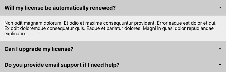
Here’s what the completed component will look like:
Let’s get started by using Create React App to setup the development environment:
npx create-react-app react-accordionNext create a new Accordion.js file in the /src directory with the following code:
import React, { useState } from "react";
import "./accordion.css";

const Accordion = ({ heading, content }) => {
  const [isActive, setIsActive] = useState(false);
  return (
    <li className="accordion-item">
      <div className="accordion-toggle" onClick={() => setIsActive(!isActive)}>
        <h3>{heading}</h3><span>{isActive ? "-" : "+"}</span>
      </div>
      {isActive && <div className="accordion-content">{content}</div>}
    </li>
  );
};

export default Accordion;Code language: JavaScript (javascript)
We need to import { useState } as this will be used to manage the state of each item in the accordion. When the accordion-toggle is clicked we are toggling the active state. Any accordion-item with a true active state will display its content and toggle the plus/minus symbol accordingly.
The accordion content will be loaded from a data.js file so create that file as follows:
export const accordionData = [
  {
    heading: "Will my license be automatically renewed?",
    content:
      "Non odit magnam dolorum. Et odio et maxime consequuntur provident. Error eaque est dolor et qui. Ex odit doloremque consequatur quis. Eaque et pariatur dolores. Magni in quasi dolor repudiandae explicabo.",
  },
  {
    heading: "Can I upgrade my license?",
    content:
      "Quos quam ipsam consequatur consequatur et distinctio. Facere vel ut dolorem. Quam quo neque quos voluptates cupiditate sit quae.",
  },
  {
    heading: "Do you provide email support if I need help?",
    content:
      "Vel et quam reprehenderit velit. Possimus accusamus eos esse vero quo modi voluptas hic. Quia illo quisquam vel quis qui. Autem labore aut incidunt. Eius non voluptatem et laboriosam in.",
  },
];Code language: JavaScript (javascript)
We can now load the accordion by replacing the contents of App.js as follows:
import React from "react";
import Accordion from "./Accordion";
import { accordionData } from "./data";

const App = () => {
  return (
    <ul className="accordion">
      {accordionData.map(({ heading, content }) => (
        <Accordion heading={heading} content={content} />
      ))}
    </ul>
  );
};

export default App;Code language: JavaScript (javascript)
This maps the data creating an accordion component for each object.
Finally we can apply some CSS in a new accordion.css file:
.accordion {
  max-width: 768px;
}
.accordion-item {
  list-style: none;
}
.accordion-toggle {
  cursor: pointer;
  display: flex;
  flex-direction: row;
  justify-content: space-between;
  background-color: #ccc;
  padding: 1em;
}
.accordion-toggle:hover {
  background-color: #ddd;
}
.accordion-toggle h3 {
  margin: 0;
}
.accordion-content {
  background-color: #eee;
  padding: 1em;
}Code language: CSS (css)
That’s all for this tutorial. As you’ve seen creating a React accordion component is a relatively straight forward task and doesn’t requires any 3rd party libraries or scripts. If you enjoyed this tutorial you can find a number of other practical tutorials on building React components here. Thanks for reading 🙂
Related Posts
#AD Shop Web Developer T-Shirts


