
Develop a simple restaurant landing page with Bootstrap 5
Last modified June 2nd 2021 |
 Source Code [GitHub]
|
#bootstrap
Source Code [GitHub]
|
#bootstrap
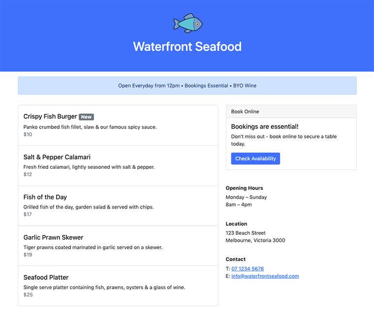
In this tutorial we’ll be using Bootstrap to build simple landing page for a restaurant. If you’re unfamiliar with Bootstrap it’s a front end framework used for building responsive websites. We’ll be using Bootstrap v5 to create a landung page that looks like the following:
Let’s get started by creating a new HTML file with the following code:
<!DOCTYPE html>
<html lang="en">
  <head>
    <meta charset="utf-8" />
    <meta name="viewport" content="width=device-width, initial-scale=1" />
    <link
      href="https://cdn.jsdelivr.net/npm/bootstrap@5.0.1/dist/css/bootstrap.min.css"
      rel="stylesheet"
      integrity="sha384-+0n0xVW2eSR5OomGNYDnhzAbDsOXxcvSN1TPprVMTNDbiYZCxYbOOl7+AMvyTG2x"
      crossorigin="anonymous"
    />
    <title>Waterfront Seafood Restaurant</title>
  </head>
  <body></body>
</html>Code language: HTML, XML (xml)
This loads the Bootstrap CSS from their official CDN (Content Delivery Network). Bootstrap does have some functionality that requires JavaScript but as we’re only building a simple landing page we’ll just include the CSS for now.
In the first section let’s add a logo and business name using the following HTML markup:
<section class="bg-primary text-center py-5">
  <img src="https://img.icons8.com/plasticine/100/000000/whole-fish.png"/>
  <h1 class="text-light">Waterfront Seafood</h1>
</section>Code language: HTML, XML (xml)- The image used for the logo was a free download from icons8.com.
bg-primary– Sets the background of the section to the default primary blue color.text-center– Whenever you need to center align text this class is added.py-5– Sets the y-axis padding (top & bottom) – this number should be between 0-5.
Next we’ll display some basic info about the business in an “alert” component so it stands out. Typically alert’s would be displayed after a user has completed an action but they also work well when used in this context:
<section class="my-3">
<div class="container">
<div class="row">
<div class="col-lg-10 offset-lg-1">
<div class="alert alert-primary text-center ">
Open Everyday from 12pm • Bookings Essential • BYO Wine
</div>
</div>
</div>
</div>
</section>Code language: HTML, XML (xml)my-3– Sets the y-axis margin in the same way padding was used in the previous section.container– If a container isn’t used the content will span the full width of the browser.col-lg-10– Bootstrap is based on a 12 column layout and we want our alert to span only 10 columns.offset-lg-1– Shifts the content across 1 column so it remains centered in the 12 column layout.alert-primary– Sets the alert color to the default primary blue.
Our next section will be spit into 2 columns on large devices (≥992px). On devices smaller than 992px the columns will be full width and stack on top of each other. If you wanted to maintain 2 columns on smaller devices you would use col-sm-6 offset-sm-1 & col-sm-4.
<section>
  <div class="container my-3">
    <div class="row">
      <div class="col-lg-6 offset-lg-1">
        <!-- column 1 : menu will go here -->
      </div>
      <div class="col-lg-4">
        <!-- column 2 : booking cta a business details go here -->
      </div>
    </div>
  </div>
</section>Code language: HTML, XML (xml)
Inside of column 1 we’ll display the restaurant’s menu using the “list-group” component:
<ul class="list-group">
<li class="list-group-item pt-4">
<h5>Crispy Fish Burger <span class="badge bg-secondary">New</span></h5>
<p>Panko crumbed fish fillet, slaw & our famous spicy sauce.<br/><span class="text-secondary">$10</span></p>
</li>
<li class="list-group-item pt-4">
<h5>Salt & Pepper Calamari</h5>
<p>Fresh fried calamari, lightly seasoned with salt & pepper.<br/><span class="text-secondary">$12</span></p>
</li>
<li class="list-group-item pt-4">
<h5>Fish of the Day</h5>
<p>Grilled fish of the day, garden salad & served with chips.<br/><span class="text-secondary">$17</span></p>
</li>
<li class="list-group-item pt-4">
<h5>Garlic Prawn Skewer</h5>
<p>Tiger prawns coated marinated in garlic served on a skewer.<br/><span class="text-secondary">$19</span></p>
</li>
<li class="list-group-item pt-4">
<h5>Seafood Platter</h5>
<p>Single serve platter containing fish, prawns, oysters & a glass of wine.<br/><span class="text-secondary">$25</span></p>
</li>
</ul> Code language: HTML, XML (xml)badge bg-secondary– Displays a small badge used to indicate that a menu item is “new”.text-secondary– Changes the text color of the prices to a lighter gray.
Inside of column 2 we’ll add a “card” component with a CTA for online bookings.
<div class="card mb-5">
  <div class="card-header">
    Bookings are essential!
  </div>
  <div class="card-body">
    <h5 class="card-title">Bookings are essential!</h5>
    <p class="card-text">Don't miss out - book online to secure a table today.</p>
    <a href="#" class="btn btn-primary">Check Availability</a>
  </div>
</div>Code language: HTML, XML (xml)
card-header & card-title– Not required if you only want to display plain text.btn– Any link with this class will render like a button.btn-primary– Sets the color of the button to the default primary blue.
Underneath the card component we’ll add the trading hours, location, and contact details.
<h6 class="font-weight-bold">Opening Hours</h6>
<p>Monday – Sunday<br />8am – 4pm</p>
<h6 class="font-weight-bold">Location</h6>
<p>123 Beach Street<br/>Melbourne, Victoria 3000</p>
<h6 class="font-weight-bold">Contact</h6>
<p>T: <a href="#">07 1234 5678</a><br />E: <a href="#">info@waterfrontseafood.com</a></p>Code language: HTML, XML (xml)The only Bootstrap used here is the font-weight-bold to display the headings in a bold font weight.
As you’ve just seen Bootstrap allows us to quickly build a visually appealing webpage. It’s also possible to build upon Bootstrap with custom CSS but we’ll save that for another tutorial.
Related Posts
#AD Shop Web Developer T-Shirts


