
5 Stylish ways to use CSS to enhance user profile images
Last modified February 20th 2021 |
 Source Code [GitHub]
|
#css
Source Code [GitHub]
|
#css
With some simple CSS you can easily enhance the look of a user profile image. Most commonly profile images are circles but these effects can also be used on other shaped images.
Here’s a look at the 5 bright and bold examples you can use as inspiration:

#1 – CSS filter:drop-shadow can be used to give a glow-like appearance.
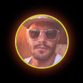
<img class="css-shadow" src="https://i.pravatar.cc/75" />Code language: JavaScript (javascript).css-shadow {
width: 75px;
height: 75px;
border-radius: 50%;
border: 2px solid #cddc39;
filter: drop-shadow(0 0 8px #ff5722);
}Code language: CSS (css)#2 – By setting the top & left borders a different color than the other borders we get this nice effect.
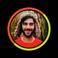
<img class="css-border" src="https://i.pravatar.cc/75" />Code language: JavaScript (javascript).css-border {
border: 4px solid #cddc39;
padding: 2px;
border-radius: 50%;
border-top-color: #ff5722;
border-left-color: #ff5722;
width: 75px;
height: 75px;
}Code language: CSS (css)#3 – Using the ::after pseudo-element we can insert an off shaped circle behind the profile image. Notice how the image is wrapped in a <div> as images can’t have pseudo elements.
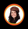
 <div class="css-after">
   <img src="https://i.pravatar.cc/75" />
 </div>Code language: HTML, XML (xml)
.css-after {
position: relative;
}
.css-after img {
width: 75px;
height: 75px;
border-radius: 50%;
border: 2px solid #cddc39;
}
.css-after::after {
content: "";
width: 85px;
height: 91px;
border-radius: 50%;
background-color: #ff5722;
display: block;
position: absolute;
top: -6px;
left: -3px;
z-index: -1;
}Code language: CSS (css)#4 – Another example using the ::after pseudo-element, this time a gradient is applied to the background.
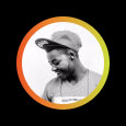
<div class="css-after-gradiant">
  <img src="https://i.pravatar.cc/75" />
</div>Code language: HTML, XML (xml)
.css-after-gradiant {
position: relative;
}
.css-after-gradiant img {
width: 75px;
height: 75px;
border-radius: 50%;
}
.css-after-gradiant::after {
content: "";
width: 85px;
height: 85px;
border-radius: 50%;
background: linear-gradient(
90deg,
rgba(255, 87, 34, 1) 0%,
rgba(205, 220, 57, 1) 100%,
rgba(0, 212, 255, 1) 100%
);
display: block;
position: absolute;
top: -5px;
left: -5px;
z-index: -1;
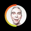
}Code language: CSS (css)#5 – Overlaying the profile image with a half circle SVG gradient gives us this popular effect.
<div class="svg-half">
  <img src="https://i.pravatar.cc/75" />
  <svg>
    <linearGradient id="gradiant">
      <stop offset="0%" style="stop-color: #ff5722;" />
      <stop offset="100%" style="stop-color: #cddc39;" />
    </linearGradient>
    <path d="M0,38 a1,1 0 0,0 75,0" />
  </svg>
</div>Code language: HTML, XML (xml)
.svg-half {
position: relative;
}
.svg-half img {
border-radius: 50%;
width: 75px;
height: 75px;
}
.svg-half svg {
position: absolute;
top: 0;
left: 0;
width: 75px;
height: 75px;
fill: none;
stroke-linecap: round;
stroke-linejoin: round;
overflow: visible;
stroke: #ff5722;
stroke-width: 6;
transform: rotate(90deg);
stroke: url(#gradiant);
}Code language: CSS (css)If you have some CSS you’ve used for profile images please feel free to get in touch and we’ll consider sharing it in this post. Also thanks to Pravatar who provide a free user placeholder service that was used for all the images.
Related Posts
#AD Shop Web Developer T-Shirts


