
Build a 3 column pricing table layout with CSS flexbox
Last modified August 8th 2024 |
 Source Code [GitHub]
|
#css #html
Source Code [GitHub]
|
#css #html
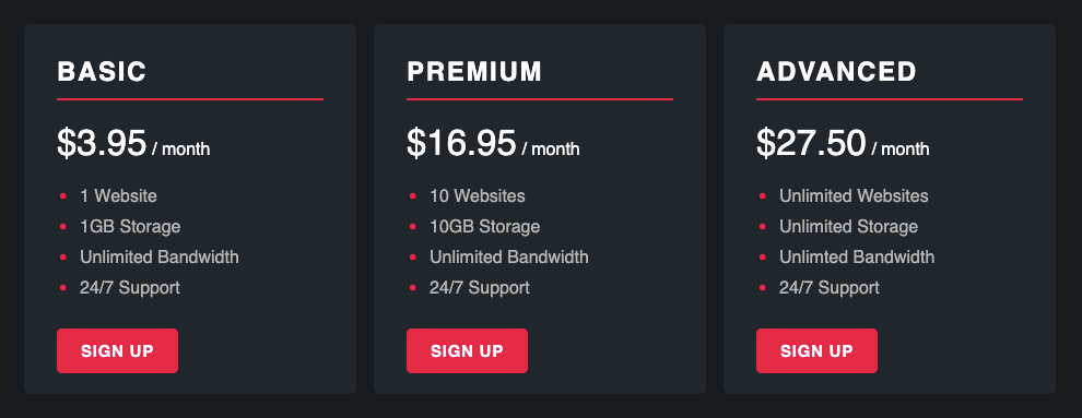
Pricing tables are a common feature on websites for businesses that offer different plans with monthly billing. In this tutorial we’ll be building a responsive 3 panel pricing table using CSS flexbox that look like the below once complete:
Let’s get started with the HTML. Flexbox layouts need a parent flex container (pricing) and child flex items (pricing-plan) to function correctly. Here is the markup for a three column layout but you could easily add or remove a flex item and the layout will adjust accordingly:
<div class="pricing">
  <div class="pricing-plan">
    <h2>Basic</h2>
    <p><span>$3.95</span> / month</p>
    <ul>
      <li>1 Website</li>
      <li>1GB Storage</li>
      <li>Unlimited Bandwidth</li>
      <li>24/7 Support</li>
    </ul>
    <a href="#">Sign up</a>
  </div>
  <div class="pricing-plan">
    <h2>Premium</h2>
    <p><span>$16.95</span> / month</p>
    <ul>
      <li>10 Websites</li>
      <li>10GB Storage</li>
      <li>Unlimited Bandwidth</li>
      <li>24/7 Support</li>
    </ul>
    <a href="#">Sign up</a>
  </div>
  <div class="pricing-plan">
    <h2>Advanced</h2>
    <p><span>$27.50</span> / month</p>
    <ul>
      <li>Unlimited Websites</li>
      <li>Unlimited Storage</li>
      <li>Unlimted Bandwidth</li>
      <li>24/7 Support</li>
    </ul>
    <a href="#">Sign up</a>
  </div>
</div>Code language: HTML, XML (xml)
Next for the CSS that’ll give us our 3 column layout:
.pricing {
  display: flex;
  justify-content: space-between;
  max-width: 960px;
  margin: auto;
}
.pricing-plan {
  flex: 1;
  background-color: #1f262c;
  margin: 15px 8px;
  padding: 30px;
  border-radius: 6px;
  color: #fff;
}Code language: CSS (css)
3 columns is a little too much information to display on smaller mobile devices so we’ll switch to a single column layout on those devices by converting the pricing element to display as a block (full width) element instead of a flex element:
@media (max-width: 768px) {
  .pricing {
    display: block;
  }
}Code language: CSS (css)
Lastly we can add some CSS so the headings, text, and links all look good:
.pricing-plan h2 {
  margin-top: 0;
  padding-bottom: 10px;
  border-bottom: 2px solid #e30046;
  text-transform: uppercase;
  letter-spacing: 0.07em;
}
.pricing-plan p {
  margin-top: 0;
}
.pricing-plan p span {
  font-size: 33px;
}
.pricing-plan ul {
  margin: 0 0 35px;
  padding-left: 16px;
  list-style: none;
  line-height: 1.8;
  color: #b5b5b5;
}
.pricing-plan ul li::before {
  content: "•";
  color: #e30046;
  display: inline-block;
  width: 20px;
  margin-left: -15px;
  position: relative;
  top: 4px;
  font-size: 26px;
  line-height: 0;
}
.pricing-plan a {
  text-decoration: none;
  color: #fff;
  padding: 10px 20px;
  text-align: center;
  background: #e30046;
  border: 2px solid #e30046;
  border-radius: 5px;
  letter-spacing: 0.05em;
  text-transform: uppercase;
  font-size: 15px;
  font-weight: bold;
}
.pricing-plan a:hover {
  background-color: #1f262c;
}Code language: CSS (css)
If this was your first time using flexbox hopefully you’ll now be able to start using it to layout other more components. As you’ve seen it really does make multi-column layouts easier to build. To learn more about flexbox “CSS Tricks” have a nice visual reference guide that can be found here.
Related Posts
#AD Shop Web Developer T-Shirts


