
How to build a dropdown mega menu with pure CSS
Last modified March 12th 2021 |
 Source Code [GitHub]
|
#css
Source Code [GitHub]
|
#css
In this tutorial we’ll be building a dropdown mega menu that I’m sure you’ve seen used on many websites. They provide a way to present users with a full list of pages available rather than having to traverse down a tree of options.
Here’s what the completed mega menu we’ll be building will look like:
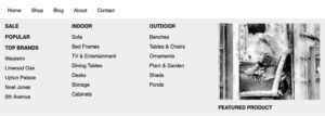
Let’s get started with the HTML markup for the top level menu items:
<nav class="nav">
  <ul class="menu">
    <li><a href="#">Home</a></li>
    <li><a href="#">Shop</a></li>
    <li><a href="#">Blog</a></li>
    <li><a href="#">About</a></li>
    <li><a href="#">Contact</a></li>
  </ul>
</nav>Code language: HTML, XML (xml)
In this instance we’ll add the dropdown to the “Shop” menu item by inserting the mega menu markup inside the “Shop” list element after the hyperlink as follows:
<li><a href="#">Shop</a>
<div class="mega-menu">
<div class="col">
<ul>
<li><a href="#"><h4>Sale</h4></a></li>
<li><a href="#"><h4>Popular</h4></a></li>
<li><a href="#"><h4>Top Brands</h4></a></li>
<li><a href="#">Westelm</a></li>
<li><a href="#">Linwood Oak</a></li>
<li><a href="#">Uptun Palace</a></li>
<li><a href="#">Noel Jones</a></li>
<li><a href="#">5th Avenue</a></li>
</ul>
</div>
<div class="col">
<ul>
<li><a href="#"><h4>Indoor</h4></a></li>
<li><a href="#">Sofa</a></li>
<li><a href="#">Bed Frames</a></li>
<li><a href="#">TV & Entertainment</a></li>
<li><a href="#">Dining Tables</a></li>
<li><a href="#">Desks</a></li>
<li><a href="#">Storage</a></li>
<li><a href="#">Cabinets</a></li>
</ul>
</div>
<div class="col">
<ul>
<li><a href="#"><h4>Outdoor</h4></a></li>
<li><a href="#">Benches</a></li>
<li><a href="#">Tables & Chairs</a></li>
<li><a href="#">Ornaments</a></li>
<li><a href="#">Plant & Garden</a></li>
<li><a href="#">Sheds</a></li>
<li><a href="#">Ponds</a></li>
</ul>
</div>
<div class="col">
<a href="#">
<img src="https://loremflickr.com/cache/resized/65535_50850469708_86a9184210_320_240_nofilter.jpg" alt="" />
<p><strong>Featured Product</strong></p>
</a>
</div>
</div>
</li> Code language: HTML, XML (xml)Now for the CSS starting with the top level menu items:
.menu {
  display: flex;
  margin: 0;
  padding: 0;
  font-family: sans-serif;
}
.menu li {
  list-style: none;
}
.menu li a {
  padding: 1em;
  display: block;
  color: black;
  text-decoration: none;
}
.menu li a:hover {
  color: #336699;
}Code language: CSS (css)
Aside from the display: flex; to align the menu items on a single row all this CSS is purely for design purposes and can easily be modified to suit your needs.
Next the CSS for the mega menu itself:
.mega-menu {
  display: flex;
  justify-content: space-between;
  position: absolute;
  left: 0;
  width: 100%;
  background: #eee;
  opacity: 0;
  visibility: hidden;
}
.menu li:hover > .mega-menu {
  opacity: 1;
  overflow: visible;
  visibility: visible;
}Code language: CSS (css)
This sets the default state of the mega menu to hidden and as we’ve used the > CSS selector we only target the mega menu which is a direct child of the element with an active hover state. By doing this we could have more that one mega menu within the same menu.
Finally the CSS for the content in the mega menu:
.mega-menu .col {
  padding: 1em;
}
.mega-menu .col ul {
  margin: 0;
  padding: 0;
}
.mega-menu .col li {
 margin-bottom: 0.75em;
}
.mega-menu .col h4 {
  text-transform: uppercase;
  margin: 0 0 1em 0;
}
.mega-menu .col a {
  padding: 0;
}
.mega-menu .col img {
  display: block;
}
.mega-menu .col p {
  margin-bottom: 0;
}
.mega-menu .col strong {
  text-transform: uppercase;
}Code language: CSS (css)
That’s all for this tutorial, thanks for reading! If this was your first time using CSS flex layouts and you don’t completely understand how they work just yet you may find this tutorial “Build a 3 column pricing plan layout with CSS flexbox” helpful.
Related Posts
#AD Shop Web Developer T-Shirts


