
Code a responsive step progress bar with HTML, CSS & JavaScript
Last modified June 28th 2024 |
 Source Code [GitHub]
|
#css #html #js
Source Code [GitHub]
|
#css #html #js
In this tutorial we’ll be creating a responsive step progress bar. These are commonly used when a large form is split into several steps. Displaying a progress bar lets users know how much of a form they have completed and how many more steps remain.
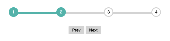
Here’s what the completed progress bar will look like:
Let’s get started by creating the required HTML markup:
<div id="progress">
  <div id="progress-bar"></div>
  <ul id="progress-num">
    <li class="step active">1</li>
    <li class="step">2</li>
    <li class="step">3</li>
    <li class="step">4</li>
  </ul>
</div>Code language: HTML, XML (xml)
You can easily add more steps here by including extra <li> elements as required as we’ll be building the progress bar in such a way that it will remain responsive and functional. We’ll also require some buttons to control the progress through each of the steps as follows:
<button id="progress-prev" class="btn" disabled>Prev</button>
<button id="progress-next" class="btn">Next</button>Code language: HTML, XML (xml)
Now for the JavaScript starting with variables for the various elements:
const progressBar = document.getElementById("progress-bar");
const progressNext = document.getElementById("progress-next");
const progressPrev = document.getElementById("progress-prev");
const steps = document.querySelectorAll(".step");
let active = 1;Code language: JavaScript (javascript)
To navigate through the steps we’ll add an eventListener to detect clicks on each of the buttons:
progressNext.addEventListener("click", () => {
  active++;
  if (active > steps.length) {
    active = steps.length;
  }
  updateProgress();
});

progressPrev.addEventListener("click", () => {
  active--;
  if (active < 1) {
    active = 1;
  }
  updateProgress();
});Code language: JavaScript (javascript)
When the eventListener is triggered it increases or decreases the active count based on which button was clicked. It also prevents the active count from going higher or lower than the number of steps. We’re also calling an updateProgress function which looks like this:
const updateProgress = () => {
  // toggle active class on list items
  steps.forEach((step, i) => {
    if (i < active) {
      step.classList.add("active");
    } else {
      step.classList.remove("active");
    }
  });
  // set progress bar width
  progressBar.style.width =
    ((active - 1) / (steps.length - 1)) * 100 + "%";
  // enable disable prev and next buttons
  if (active === 1) {
    progressPrev.disabled = true;
  } else if (active === steps.length) {
    progressNext.disabled = true;
  } else {
    progressPrev.disabled = false;
    progressNext.disabled = false;
  }
};Code language: JavaScript (javascript)
This does 3 things:
- Loops through each of the steps and toggles the active class.
- Set’s the progress bar width as a percentage based on the active and total steps.
- Disables the appropriate button when the active step is either the first or last step.
Now we can add some CSS to see the progress bar in action:
#progress {
  position: relative;
  margin-bottom: 30px;
}Code language: CSS (css)
Relative positioning is used on the parent element so we can use absolute positioning on the children elements.
#progress-bar {
  position: absolute;
  background: lightseagreen;
  height: 5px;
  width: 0%;
  top: 50%;
  left: 0;
}Code language: CSS (css)
This sets the base styles for the the progress bar, it’s width is updated via JavaScript.
#progress-num {
  margin: 0;
  padding: 0;
  list-style: none;
  display: flex;
  justify-content: space-between;
}Code language: CSS (css)
Flex layout is used here to allow us evenly distribute the numbers within the parent <div> no matter its width.
#progress-num::before {
  content: "";
  background-color: lightgray;
  position: absolute;
  top: 50%;
  left: 0;
  height: 5px;
  width: 100%;
  z-index: -1;
}Code language: CSS (css)
CSS pseudo-element that represents the inactive (gray) portion of the progress bar.
#progress-num .step {
  border: 3px solid lightgray;
  border-radius: 100%;
  width: 25px;
  height: 25px;
  line-height: 25px;
  text-align: center;
  background-color: #fff;
  font-family: sans-serif;
  font-size: 14px;
  position: relative;
  z-index: 1;
}Code language: CSS (css)
Styles each of the inactive steps inside a circle.
#progress-num .step.active {
  border-color: lightseagreen;
  background-color: lightseagreen;
  color: #fff;
}Code language: CSS (css)
Styles the active steps border and background color to match the progress bar.
That’s all for this tutorial, you should now have a working responsive step progress bar that you can can easily be customised to suit your individual requirements. As always you can find the full working source code used in this tutorial on Github.
Related Posts
#AD Shop Web Developer T-Shirts


