
Style a login form with Tailwind CSS
Last modified February 8th 2021 |
 Source Code [GitHub]
|
#tailwind
Source Code [GitHub]
|
#tailwind
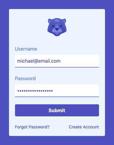
Unlike other CSS frameworks Tailwind doesn’t provide pre-designed components. Instead it provides a set of utility classes that can be used for creating bespoke designs. In this tutorial we’ll be using Tailwind to design a login form that’ll look like the following when complete:
Let’s get started by creating a new HTML file and loading Tailwind via CDN:
<!DOCTYPE html>
<html lang="en">
  <head>
    <meta charset="UTF-8" />
    <meta name="viewport" content="width=device-width, initial-scale=1">
    <title>Tailwind CSS Login Form</title>
    <link
      rel="stylesheet"
      href="https://unpkg.com/tailwindcss@^1.0/dist/tailwind.min.css" />
  </head>
  <body>
  </body>
</html>Code language: HTML, XML (xml)
To get the most out of Tailwind it’s preferable to install it into your project via npm. For the purposes of this tutorial using the CDN will allow us to get up and running quickly.
As this form will be a standalone component in the page we’ll add some classes to the <body> element. If you want to include this component within an existing layout it could be applied to a wrapper <div> instead:
<body class="flex h-screen bg-indigo-700">Code language: JavaScript (javascript)flex h-screen– center align the login form both horizontally and vertically.bg-indigo-700– adds an indigo background color.
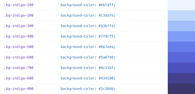
Colors in Tailwind can have a value from 100 (light) to 900 (dark).
We’ll then create a wrapper <div> with the following classes:
<div class="max-w-xs w-full m-auto bg-indigo-100 rounded p-5">
  <!-- header -->
  <!-- form -->
  <!-- footer -->
</div>Code language: HTML, XML (xml)max-w-xs– sets the maximum width of the form to extra small (2rem).w-full– ensures the component spans the full width we specified.m-auto– auto margin all around to center align the form.rounded– adds the standard rounded border radius.p-5– defines even padding all around.
First up inside the wrapper <div> is the <header> which contains the logo image:
<!-- header -->
<header>
  <img class="w-20 mx-auto mb-5" src="https://img.icons8.com/fluent/344/year-of-tiger.png" />
</header>Code language: HTML, XML (xml)w-20– logo is 344 pixels wide so this will limit the width to a more suitable 80 pixels.mx-auto– set the x-axis margin (left & right) auto so the logo is center aligned.mb-5– applies a margin to the bottom of the logo only.
Our form will have a username field, password field and submit button:
<!-- form -->
<form>
   <div>
    <label class="block mb-2 text-indigo-500" for="username">Username</label>
    <input class="w-full p-2 mb-6 text-indigo-700 border-b-2 border-indigo-500 outline-none focus:bg-gray-300" type="text" name="username">
  </div>
  <div>
    <label class="block mb-2 text-indigo-500" for="password">Password</label>
    <input class="w-full p-2 mb-6 text-indigo-700 border-b-2 border-indigo-500 outline-none focus:bg-gray-300" type="password" name="password">
  </div>
  <div>
    <input class="w-full bg-indigo-700 hover:bg-pink-700 text-white font-bold py-2 px-4 mb-6 rounded" type="submit">
  </div>
</form>Code language: HTML, XML (xml)block– display labels as block elements so they appear above the input fields.border-b-2 border-indigo-500– 2px indigo border on the bottom of the text fields.outline-none– override the default browser focus style.focus:bg-gray-300– change the background color when field is in focus.hover:bg-pink-700– hover styles in Tailwind are applied by prepending with hover.
Finally the <footer> which contains a “Forgot Password” and “Create Account” link:
<!-- footer -->
<footer>
  <a class="text-indigo-700 hover:text-pink-700 text-sm float-left" href="#">Forgot Password?</a>
  <a class="text-indigo-700 hover:text-pink-700 text-sm float-right" href="#">Create Account</a>
</footer> Code language: HTML, XML (xml)text-sm– reduces the font size slightly from the default base font size.float-left float-right– applies standard CSS floats.
Hopefully this tutorial has shown just how fast custom components can be built using Tailwind. Whilst a login form is a simple example it uses many of the key Tailwind classes. If you would like to learn more about all of Tailwind’s features check out the official documentation.
Related Posts
#AD Shop Web Developer T-Shirts


