
Style a responsive navbar component with Tailwind CSS
Last modified May 18th 2021 |
 Source Code [GitHub]
|
#tailwind
Source Code [GitHub]
|
#tailwind
In this tutorial we’ll be building a responsive navbar using the Tailwind CSS framework. Unlike other CSS frameworks Tailwind doesn’t include any pre-built components but rather allows you to design and build custom components using utility classes.
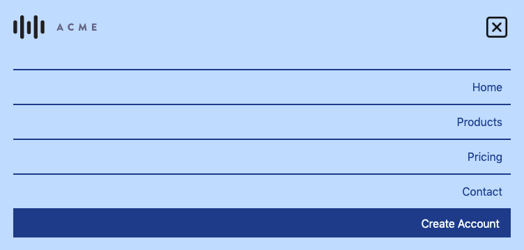
Once finished the responsive navbar will look like the following on desktop and mobile devices:

For the purposes of this tutorial we’ll install Tailwind using a CDN but in production environments it’s recommend to install Tailwind as a PostCSS plugin.
Let’s get started by creating a HTML file with the following markup:
<!DOCTYPE html>
<html lang="en">
  <head>
    <meta charset="UTF-8" />
    <meta name="viewport" content="width=device-width, initial-scale=1" />
    <title>Responsive Navbar - Tailwind CSS</title>
    <link href="https://unpkg.com/tailwindcss@^2/dist/tailwind.min.css" rel="stylesheet" />
  </head>
  <body>
    <!-- navbar here -->
    <script src="script.js"></script>
  </body>
</html>Code language: HTML, XML (xml)
First is the navbar wrapper element:
<nav class="flex flex-wrap items-center justify-between p-5 bg-blue-200">
<!-- logo -->
<!-- hamburger -->
<!-- links -->
<!-- cta -->
</nav>  Code language: HTML, XML (xml)
flex flex-wrap– display using flexbox and wrap items larger than the parent.items-center– align items along the center of the x-axis.justify-between– evenly distribute’s navbar elements across the horizontal axis.p-5– add’s even padding to all sides of the navbar.bg-blue-200– light blue background color.
The first element in the navbar is a logo which doesn’t require any CSS:
<img src="http://acmelogos.com/images/logo-1.svg" alt="ACME" width="120" /> Code language: HTML, XML (xml)Next comes the hamburger button for toggling the menu visibility on small screen’s:
<div class="flex md:hidden">
  <button id="hamburger">
    <img class="toggle block" src="https://img.icons8.com/fluent-systems-regular/2x/menu-squared-2.png" width="40" height="40" />
    <img class="toggle hidden" src="https://img.icons8.com/fluent-systems-regular/2x/close-window.png" width="40" height="40" />
  </button>
</div>Code language: HTML, XML (xml)
Tailwind CSS follow’s the mobile-first approach, so we build from small to larger screen’s. In this instance the hamburger is visible on small screens (flex) then hidden on medium (md:hidden) and above sized screens.
We’ve also used a toggle class here that isn’t actually part of Tailwind. This class will be applied to everything that we wan’t to toggle the visibility of when the hamburger button is clicked.
Text links have a wrapper <div> once again using toggle:
<div class="toggle hidden md:flex w-full md:w-auto text-right text-bold mt-5 md:mt-0 border-t-2 border-blue-900 md:border-none">
  <a href="#" class="block md:inline-block text-blue-900 hover:text-blue-500 px-3 py-3 border-b-2 border-blue-900 md:border-none">Home</a>
  <a href="#" class="block md:inline-block text-blue-900 hover:text-blue-500 px-3 py-3 border-b-2 border-blue-900 md:border-none">Products</a>
  <a href="#" class="block md:inline-block text-blue-900 hover:text-blue-500 px-3 py-3 border-b-2 border-blue-900 md:border-none">Pricing</a>
  <a href="#" class="block md:inline-block text-blue-900 hover:text-blue-500 px-3 py-3 border-b-2 border-blue-900 md:border-none">Contact</a>
</div>Code language: HTML, XML (xml)
Firstly let’s go over the classes used on the wrapper <div> element:
hidden md:flex– hide links on smaller screens until the visibility is toggled.w-full md:w-auto– display the menu as full width on small screens only.text-right text-bold– right align the text with a bold font weight.mt-5 md:mt-0– applies a margin to the top of the menu.border-t-2 border-blue-900– single blue 2px dividing border on the top of the menu.md:border-none– remove border on larger screens.
And the individual text links:
block md:inline-block– display block on small screens and inline on larger screens.text-blue-900 hover:text-blue-500– blue text that lightens on hover.px-3 py-3– even padding on both the x-axis (horizontal) and y-axis (vertical).border-b-2 border-blue-900– blue 2px border on the bottom of the links.md:border-none– remove border on larger screens.
Finally we’ll include a CTA button to the far right of the navbar:
<a href="#" class="toggle hidden md:flex w-full md:w-auto px-4 py-2 text-right bg-blue-900 hover:bg-blue-500 text-white md:rounded">Create Account</a>Code language: HTML, XML (xml)The only class we haven’t used previously is md:rounded which applies a border radius giving the button corner’s a slightly rounded apperance.
That completes the CSS now we just need to add the JavaScript to toggle the menu visibility on small screen’s. Create a script.js file with the following:
document.getElementById("hamburger").onclick = function toggleMenu() {
  const navToggle = document.getElementsByClassName("toggle");
  for (let i = 0; i < navToggle.length; i++) {
    navToggle.item(i).classList.toggle("hidden");
  }
};Code language: JavaScript (javascript)
This toggles the hidden class on toggle elements when the hamburger is clicked.
You should now be able to style your own responsive navbar using Tailwind CSS. If you would like to learn more about Tailwind and all the available classes the official documentation is very user friendly.
Related Posts
#AD Shop Web Developer T-Shirts


