
Add animated CSS hotspots to a responsive image
Last modified February 16th 2021 |
 Source Code [GitHub]
|
#css #html
Source Code [GitHub]
|
#css #html
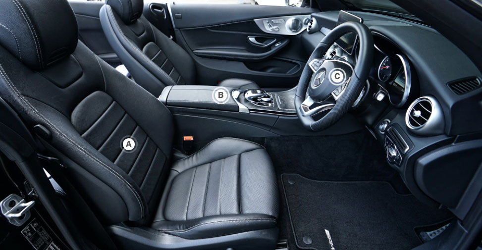
Hotspots are visual indicators applied over an image with a call to action (hyperlink, tooltip, modal). In this example we’ll be adding CSS hotspots to a responsive image that highlights some features of a car interior.
Let’s get started with the HTML:
<div class="hotspots">
  <img src="https://images.pexels.com/photos/1104768/pexels-photo-1104768.jpeg" />
  <a href="#" class="hotspot" id="hs-a">A</a>
  <a href="#" class="hotspot" id="hs-b">B</a>
  <a href="#" class="hotspot" id="hs-c">C</a>
</div>   Code language: HTML, XML (xml)
If you require more hotspots just be sure to give each of them a unique id.
Now for the CSS. So we can position the hotspots we need a relative positioned parent (.hotspots) and absolute positioned children (.hotspot):
.hotspots {
  position: relative;
}
.hotspots img {
  max-width: 100%;
  height: auto;
  display: block;
}
.hotspot {
  position: absolute;
  width: 30px;
  height: 24px;
  padding-top: 6px;
  border: 3px solid rgb(255, 255, 255, 0.8);
  border-radius: 50%;
  animation: fader 2s ease infinite;
  transition: all 0.2s;
  text-align: center;
  text-decoration: none;
  font-weight: bold;
  font-family: sans-serif;
  color: #555;
}
.hotspot::after {
  content: "";
  width: 24px;
  height: 24px;
  background-color: #fff;
  border-radius: 50%;
  display: block;
  margin: -21px auto 0 3px;
  transition: all 0.2s;
}Code language: CSS (css)
We can now position the hotspots in the desired locations using percentage based measurements. If you resize your browser the hotspots will now maintain their position over the image as the positioning scales relative to the image size scaling:
#hs-a {
  top: 50%;
  left: 25%;
}
#hs-b {
  top: 32%;
  left: 44%;
}
#hs-c {
  top: 25%;
  left: 68%;
}Code language: CSS (css)
To finish we’ll add some simple animation and hover effects. The following CSS will turn the hotspots green on hover and also fade the border in and out:
hotspot:hover {
  border-color: lightseagreen !important;
  animation-play-state: paused;
  color: #fff;
}
.hotspot:hover::after {
  background-color: lightseagreen;
}
@keyframes fader {
  50% {
    border-color: rgb(255, 255, 255, 0.2);
  }
  100% {
    border-color: rgb(255, 255, 255, 0.8);
  }
}Code language: CSS (css)
That’s all for this tutorial, we kept things simple and created hyperlinked CSS hotspots but you could take this one step further and try adding tooltips instead.
Related Posts
#AD Shop Web Developer T-Shirts


