
How to create a sticky navbar with CSS & JavaScript
Last modified February 18th 2023 |
 Source Code [GitHub]
|
#css #js
Source Code [GitHub]
|
#css #js
Sticky navbar’s allow users to access a website’s navigation even when they’ve scrolled down the page. This allows users to quickly jump between pages once they’ve read the content without having to scroll all the way back to the top.
In this tutorial we’ll be creating a sticky navbar that also shrinks in size when the navigation becomes sticky. It should be noted that if you don’t wish to add the additional effects you can simply use CSS position: sticky; property on the navigation.
Let’s get started with the HTML markup:
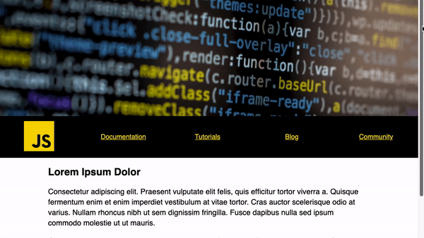
<header id="header"></header>
<nav id="nav">
  <ul>
    <li><a href="#"><img src="https://img.icons8.com/color/96/000000/javascript.png" height="96" /></a></li>
    <li><a href="#">Documentation</a></li>
    <li><a href="#">Tutorials</a></li>
    <li><a href="#">Blog</a></li>
    <li><a href="#">Community</a></li>
  </ul>
<article>
  <h1>Lorem Ipsum Dolor</h1>
  <p>Consectetur adipiscing elit. Praesent vulputate elit felis, quis efficitur tortor viverra a. Quisque fermentum enim et enim imperdiet vestibulum at vitae tortor. Cras auctor scelerisque odio at varius. Nullam rhoncus nibh ut sem dignissim fringilla. Fusce dapibus nulla sed ipsum commodo molestie ut ut mauris.</p>
  <!-- repeat as required -->
</article>
</nav>Code language: HTML, XML (xml)
Next for the CSS:
#header {
  height: 30vh;
  background: url(https://images.pexels.com/photos/1089440/pexels-photo-1089440.jpeg?auto=compress&cs=tinysrgb&dpr=2&h=650&w=940);
  background-size: cover;
}
#nav {
  background-color: #000;
  top: 0;
  width: 100%;
}
#nav ul {
  margin: 0;
  padding: 0;
  list-style: none;
  display: flex;
}
#nav li {
  flex: 1;
  display: flex;
  justify-content: center;
  align-items: center;
}
#nav ul li a {
  color: #ffd600;
  transition: all 0.4s;
}
#nav ul li img {
  height: 96px;
  transition: height 0.4s;
}Code language: CSS (css)
This creates a full width header image and a full width navbar with each of the <li> elements disturbed evenly apart as we’ve used the flex CSS property.
Now for the JavaScript. We’ll use an event listener that is triggered when the window is scrolled calling a fixedNav() function. This function detects when the <nav> has reached the top of the browser and adds a fixed CSS class:
const nav = document.querySelector('#nav');
let navTop = nav.offsetTop;

function fixedNav() {
  if (window.scrollY >= navTop) {
    nav.classList.add('fixed');
  } else {
    nav.classList.remove('fixed');
  }
}

window.addEventListener('scroll', fixedNav);Code language: JavaScript (javascript)
Finally the CSS for when the navbar has the fixed class activated:
#nav.fixed {
  position: fixed;
  box-shadow: 5px 5px 19px 0px rgba(0, 0, 0, 0.5);
}
#nav.fixed ul li img {
  height: 36px;
}
#nav.fixed ul li a {
  font-size: 14px;
}Code language: CSS (css)
As we have transitions on the <img> and <a> elements when the fixed class is applied they’ll scale to the new size smoothly. This is however optional as you could just add the fixed positioning for a sticky navbar without any scaling.
Now you know how the sticky navbar effect is achieved you’ll be able to easily implement this functionality into your next project. You can find a working copy of this code on GitHub. Thanks for reading!
Related Posts
#AD Shop Web Developer T-Shirts


