
Create a responsive popup modal with CSS & JavaScript
Last modified February 18th 2023 |
 Source Code [GitHub]
|
#css #js
Source Code [GitHub]
|
#css #js
A popup modal is a UI element that appears in the foreground of a website. They’re usually triggered by the user allowing them to view more information or complete an action without having to navigate to another URL. In this tutorial we’ll be creating a responsive popup modal styled with CSS and JavaScript functionality.
Let’s get start by creating the required HTML markup:
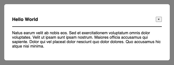
<div id="demo-modal" class="modal" role="dialog" tabindex="-1">
<div class="model-inner">
<div class="modal-header">
<h3>Hello World</h3>
<button class="modal-close" data-id="demo-modal" aria-label="Close">
×
</button>
</div>
<p>
Natus earum velit ab nobis eos. Sed et exercitationem voluptatum omnis
dolor voluptates. Velit ut ipsam sunt ipsam nostrum. Maiores officia
accusamus qui sapiente. Dolor qui vel placeat dolor nesciunt quo dolor
dolores. Quo accusamus hic atque nisi minima.
</p>
</div>
</div>
<button class="modal-open" data-id="demo-modal">Display Modal</button>Code language: HTML, XML (xml)All of the content within the demo-modal is optional and included for the purposes of this tutorial, you could replace with whatever content you like when using this on a real website. There is also a button to trigger the popup and display of the model.
Note: We’re building this in a way that would allow us to include multiple modals in a single page. We do this by using matching id / data-id attributes on each modal and the corresponding open and close buttons.
Next we’ll tackle the JavaScript functionality starting with an event listener for when users click on the open and close buttons.
let modal;
document.addEventListener("click", (e) => {
  if (e.target.className === "modal-open") {
    modal = document.getElementById(e.target.dataset.id);
    openModal(modal);
  } else if (e.target.className === "modal-close") {
    closeModal(modal);
  } else {
    return;
  }
});Code language: JavaScript (javascript)
This code detects if the user clicked either the open or close button (based on the button class), then triggers the relevant function. We’ll start with the openModal function:
const openModal = (modal) => {
  document.body.style.overflow = "hidden";
  modal.setAttribute("open", "true");
  document.addEventListener("keydown", escClose);
  let overlay = document.createElement("div");
  overlay.id = "modal-overlay";
  document.body.appendChild(overlay);
};Code language: JavaScript (javascript)
And for the closeModal function:
const closeModal = (modal) => {
  document.body.style.overflow = "auto";
  modal.removeAttribute("open");
  document.removeEventListener("keydown", escClose);
  document.body.removeChild(document.getElementById("modal-overlay"));
};Code language: JavaScript (javascript)
You may have noticed an escClose event listener in the previous two functions. This is so the the modal can be closed by pressing the escape key, here’s the code for that:
const escClose = (e) => {
  if (e.keyCode == 27) {
    closeModal();
  }
};Code language: JavaScript (javascript)
Each key on a keyboard has it’s own unique keyCode for the “escape” key it’s 27.
That’s all for the JavaScript we can now move onto the CSS:
.modal {
  display: none;
  align-items: center;
  justify-content: center;
  position: fixed;
  z-index: 1;
  width: 100%;
  height: 100%;
}
.modal[open] {
  display: flex;
}
.model-inner {
  background-color: white;
  border-radius: 0.5em;
  max-width: 600px;
  padding: 2em;
  margin: auto;
}
.modal-header {
  display: flex;
  align-items: center;
  justify-content: space-between;
  border-bottom: 2px solid black;
}
#modal-overlay {
  width: 100%;
  height: 100%;
  position: fixed;
  top: 0;
  left: 0;
  z-index: 0;
  background-color: black;
  opacity: 0.5;
}Code language: CSS (css)
And here’s what the finished popup modal looks like once complete:
That’s all for this tutorial. By following along you’ll have learnt how to build a modal popup without having to rely on any external JavasScript plugins or libraries. A full working version of this modal can be found on CodePen and the source code is also available on GitHub.
Related Posts
#AD Shop Web Developer T-Shirts


