
Build a React sidebar navigation component
Last modified September 19th 2022 |
 Source Code [GitHub]
|
#react
Source Code [GitHub]
|
#react
In this tutorial we’ll be building a slide-out sidebar navigation component. Traditionally this type of navigation was implemented on mobile devices but it’s becoming common practice to also use them on desktop devices.
We’ll be creating pages for each of the links in the navigation so you’ll also get an introduction to React Router if you haven’t already.
Let’s get started by setting up the project using the React Create App package:
npx react-create-app react-sidebarThe only dependency required is React Router so let’s install that as well:
npm install react-router-domCreate a pages folder in the src directory with home.js, services.js, and contact.js files. These are just placeholder files so we can navigate between the pages in our navigation.
Inside each of the files we’ll render some simple content so we can see when the page has changed. Be sure to replace the function name and text in each file to correspond with the filename:
import React from "react";
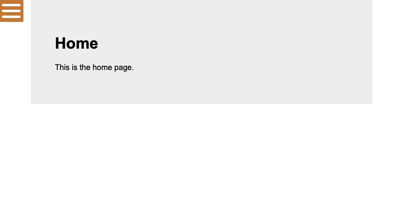
function Home() {
return (
<div className="page">
<h1>Home</h1>
<p>This is the home page.</p>
</div>
);
}
export default Home;Code language: JavaScript (javascript)Next create a components folder in the src directory with a Sidebar.js and Sidebar.css file:
Inside Sidebar.js add the following imports:
import React, { useState } from "react";
import { Link } from "react-router-dom";
import "./Sidebar.css";Code language: JavaScript (javascript)
useState hook will be used to store the “active” state of the navigation and Link is used to render the links.
Next add a Sidebar() function as follows:
function Sidebar() {
  const [sidebar, setSidebar] = useState(false);
  const showSidebar = () => setSidebar(!sidebar);
  return (
    <nav className={sidebar ? "sidebar active" : "sidebar"}>
      <button className="hamburger" type="button" onClick={showSidebar}>
        <div></div>
      </button>
      <ul onClick={showSidebar}>
        <li><Link to="/">Home</Link></li>
        <li><Link to="/services">Services</Link></li>
        <li><Link to="/contact">Contact</Link></li>
      </ul>
    </nav>
  );
}

export default Sidebar;Code language: JavaScript (javascript)
When the onClick is triggered we set the sidebar state to true which adds an active class. You’ll see later when the CSS is applied that the active class shifts the position of the sidebar from offscreen into view.
<Link> renders a fully accessible anchor tag which contains the URL well route to the corresponding file in the pages folder.
With the sidebar component completed we can now load it into App.js and setup the routes, but first the imports:
import React from "react";
import { BrowserRouter as Router, Switch, Route } from "react-router-dom";
import Home from "./pages/Home";
import Services from "./pages/Services";
import Contact from "./pages/Contact";
import Sidebar from "./components/Sidebar";
import "./App.css";Code language: JavaScript (javascript)
Then edit the App() function as follows:
function App() {
  return (
    <>
      <Router>
        <Sidebar />
        <Switch>
          <Route path="/" exact component={Home} />
          <Route path="/services" component={Services} />
          <Route path="/contact" component={Contact} />
        </Switch>
      </Router>
    </>
  );
}

export default App;Code language: JavaScript (javascript)
<Router> is the primary component of React Router that’s responsible for keeping the UI and the URL in sync. <Switch> looks through all its children <Route> elements and renders the first one with a path matching the current URL.
That’s it for the JavaScript we can now add some CSS inside Sidebar.css.
First we’ll set the default position of the sidebar off-screen. When the active class is triggered it’s position changes to align with the left side of the browser. As the sidebar has a transition it’ll animate into position.
.sidebar {
  position: fixed;
  top: 0;
  left: -300px;
  width: 300px;
  height: 100%;
  background-color: peru;
  transition: left 300ms ease-out;
}
.sidebar.active {
  left: 0;
}Code language: CSS (css)
Next some basic style for each of the links in the navigation:
.sidebar ul {
  margin: 0;
  padding: 0;
}
.sidebar li {
  list-style: none;
}
.sidebar li a {
  font-size: 18px;
  text-decoration: none;
  padding: 10px;
  display: block;
  color: #fff;
}Code language: CSS (css)
A hamburger (menu) icon can be created with CSS:
.hamburger {
  border: none;
  outline: 0;
  width: 50px;
  position: absolute;
  right: -50px;
  background-color: peru;
}

.hamburger:after,
.hamburger:before,
.hamburger div {
  background-color: #fff;
  height: 5px;
  margin: 7px 0;
  border-radius: 3px;
  content: "";
  display: block;
  transition: all 300ms ease-in-out;
}Code language: CSS (css)
Finally we can transform the hamburger icon into a cross icon when the sidebar is active:
.sidebar.active .hamburger:before {
  transform: translateY(12px) rotate(135deg);
}
.sidebar.active .hamburger::after {
  transform: translateY(-12px) rotate(-135deg);
}
.sidebar.active .hamburger div {
  transform: scale(0);
}Code language: CSS (css)
This CSS hides the middle row of the hamburger icon and rotates the top (:before) and bottom (:after) rows to form a cross.
Related Posts
#AD Shop Web Developer T-Shirts


